Although Tescos may have put many out of business I can only admire them for their diversity and growth as a business, going from food to tech and local to international. At face value they may be seen as a mundane and common brand but in terms of thinking and strategy they tend to shift into new markets quite cleverly and successfully.
Despite all of the above, what I’ve never really liked is the Tesco Identity Design. Compared to its competitors it lacks character, style and quite possibly purpose due to its now wide range of offerings.
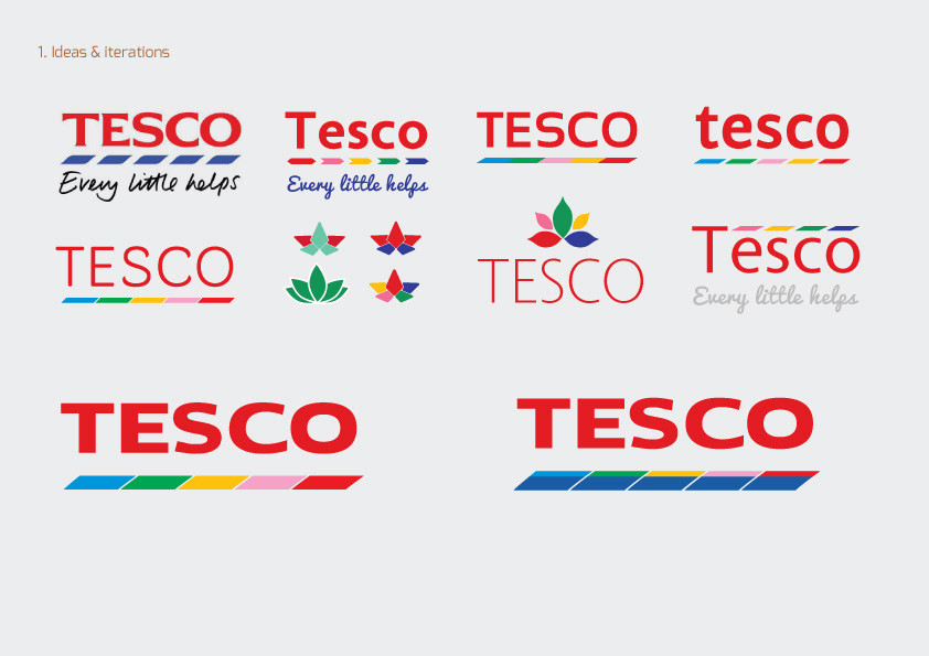
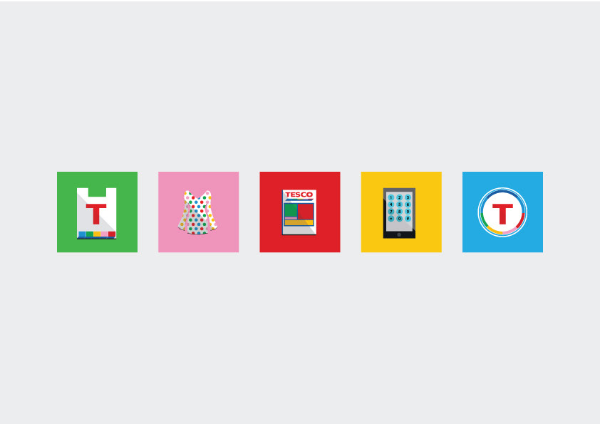
As a private case study I decided to revamp the Tesco Identity to see what it could become. Despite my own personal preference the goal was to tweak the design with the following goals:
- Not to stray far from its current identity
- Look at Tescos past designs to see how it could revitalise some of its initial success
- Keep in mind it’s a global powerhouse
- Keep in mind it’s also a friendly household name
- Communicate it’s now diverse range
- Infuse more character
- Make it more welcoming
- Add a contemporary touch

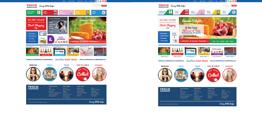
Draft Designs:
(Left) Too cluttered
(Right) Too cluttered
(Right) Too cluttered
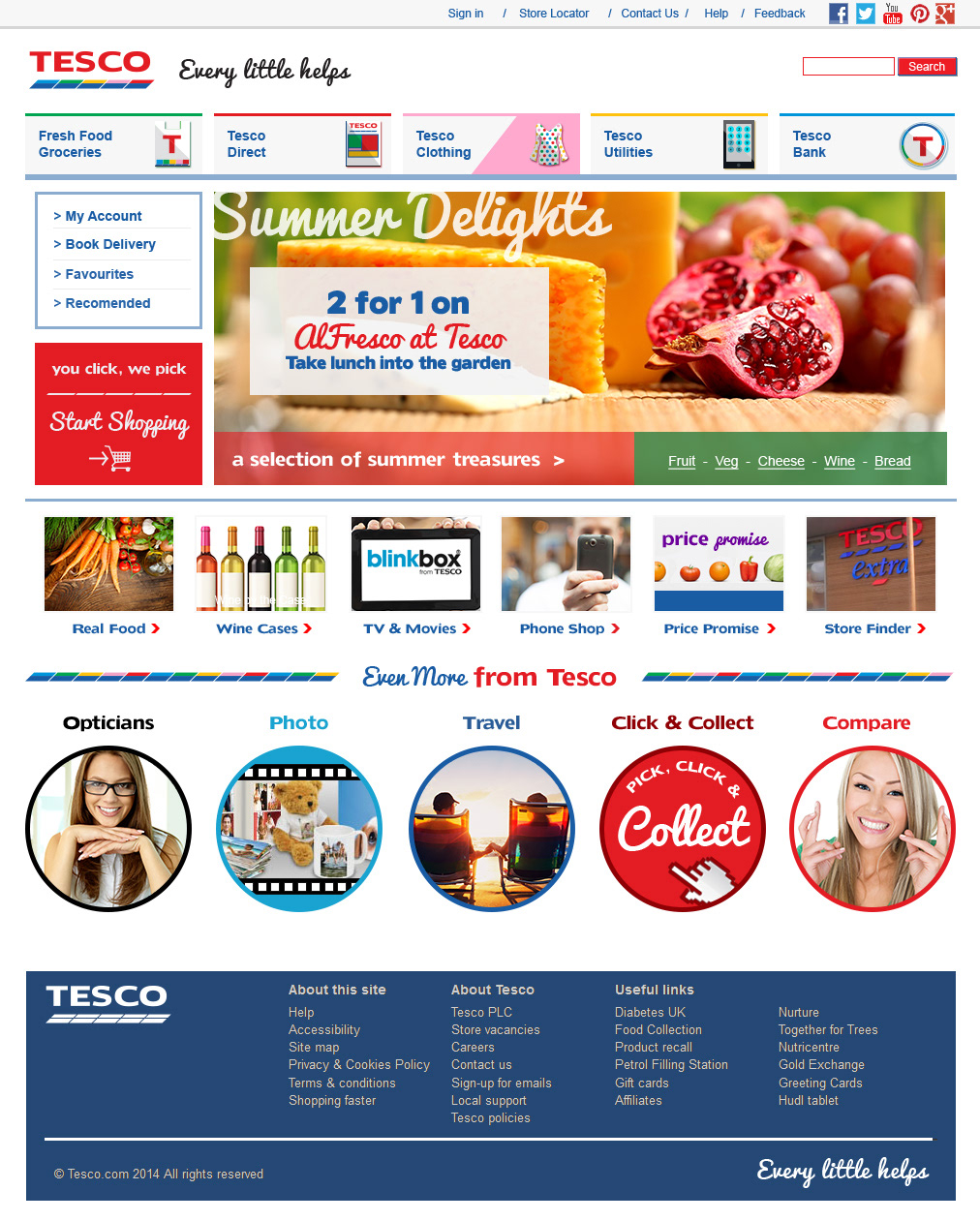
(Bottom) Final revision